

Prints are a great way to add whimsy and character to your interior. Whether on wallpaper, a bed set or even a cushion, patterns are part of the current decor trends ! However, the art of mix and match can sometimes be complicated to grasp... Colors, shapes and sizes are important to create a harmonious balance within your interior. Animals or geometric, the residents therefore give you all their advice to tame patterns.
Prints go together when:
- they are of the same motive
- they are the same color or tone
Polka dots with polka dots and stripes with stripes
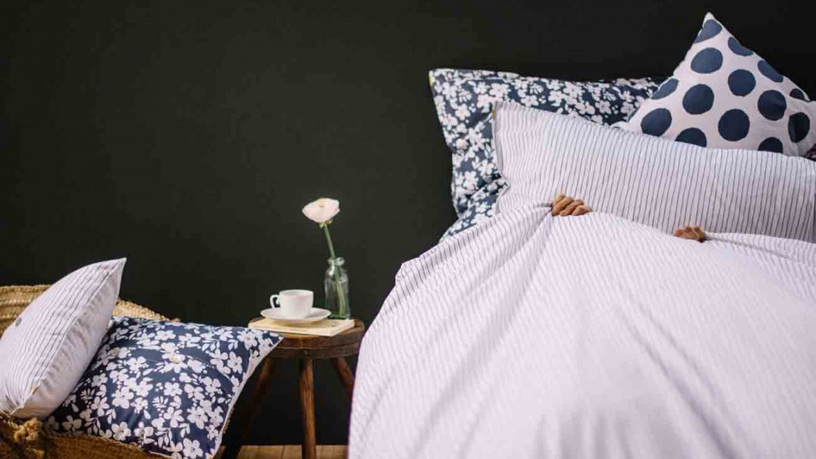
Indeed, prints of the same pattern match perfectly! From then on, you can play on their size or color according to your desires! For example, polka dot patterns, whether small or large (like ours) go very well together since they share a common style!
Here, we really like the combination of the two floral patterns. Red and blue are the colors that link the two patterns. We would have liked to see a striped tea towel from Les pensionnaires instead of the one presented, wouldn't you?

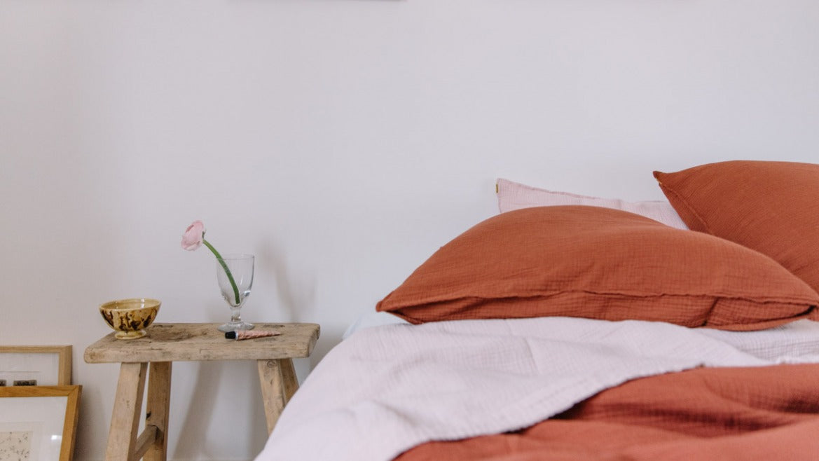
Patterns of the same color match
Are you torn between stripes , checks, polka dots or flowers ? Don't panic! No need to choose, they all go together! In fact, if you haven't already, we recommend that you read our article on the subject, we present them all here . All prints The residents are the same color, so it's impossible to go wrong! A checkered duvet cover will go perfectly with a floral pillowcase and a polka dot one. We'll let you see for yourself!

You can also choose two or three colors for your entire room and create associations around them to ensure a harmonious balance. Afterwards, nothing could be simpler: keep the same color palette for your patterns!
Be careful not to mix only patterns that are too complex for the eye because, even in the same color, it could quickly make the room overloaded or even stifling! For example, zebra, leopard and flowers, we don't know about you, but that scares us a little...! The goal is to calm a complex print with another simpler and more traditional one or to use it sparingly.
Below, as mentioned above, the large tiles of the wallpaper go very well with those of the curtains. They soften the more complex pattern of the carpet. In addition, all the colors of the room are in harmony with those of the patterns. For us, this combination is successful!

Our last 3 tips before getting started:
A single print. For those who are more sensitive to the cold, choose a single pattern to combine with solid colors. If your print is multi-colored, you can use a tone of the latter. In this case, dare to use a complex pattern like large flowers, an oriental pattern or why not toile de jouy ?!
Play on the size of the patterns. If you choose 3 patterns, make sure to have one large, one medium and one small or one large and two medium... We have already mentioned this previously but playing on the size of the prints will allow you to have a harmonious result and avoid the dreaded effect: an overloaded room!
Finally, our last piece of advice is that there are no rules! Want a bit of change? Patterns are a simple way to modernize and energize your interior. Have fun and try out new combinations, your eye will guide you!


Leave a comment
This site is protected by hCaptcha and the hCaptcha Privacy Policy and Terms of Service apply.